PrettyShot guide
The best aspect ratio for social media screenshots
The best aspect ratio is the one that keeps your screenshot readable in its destination. Use Square for a flexible feed image, Tall for vertical placements, Landscape for wide content, and Original when preserving the full capture matters more than filling a preset canvas.

The short version
- 01
Name the destination
Decide whether the image is for a feed, Story, wide post, slide, or message.
- 02
Protect readability
Choose the ratio that keeps the screenshot large enough to read.
- 03
Rebalance the canvas
Review padding and background placement after changing the ratio.
- 04
Export separately
Save a tailored file for each destination instead of relying on automatic crops.
Start with the shape of the screenshot
A long phone conversation naturally fits a tall canvas. A desktop dashboard may remain clearer in landscape. A short quote, app review, or product photo can work inside a square. Choosing against the source shape can shrink text or create so much empty space that the subject loses impact.
Crop unrelated areas before selecting the export ratio. This gives the useful content more room and may change which format works best. Keep source context such as a profile name or app title when it helps the viewer understand what they are seeing.
Use Square for flexible feed sharing
Square images are predictable and easy to reuse. They suit short testimonials, product photos, compact messages, and screenshots with a central subject. A square canvas also leaves room for an even background around a portrait-oriented capture without becoming extremely tall.
The tradeoff is text size. A wide screenshot placed inside a square may need substantial empty space above and below or may become too small to read. In that case, choose Landscape or crop the screenshot to its important region before framing it.
Use Tall for Stories and mobile-first posts
Tall images use more vertical screen space and suit phone screenshots, quote cards, and step-by-step examples. They are the natural choice for Story-style placements. Keep important content away from the extreme top and bottom, where platform controls may cover part of the image.
A tall canvas does not require the screenshot itself to fill the full height. Add background above and below when you need safe space, but keep the capture large enough to read without zooming. Review the exported file on a phone before posting.
Use Landscape for wide interfaces and slides
Landscape works for dashboards, charts, website captures, and presentation slides. It preserves horizontal relationships that would be lost in a narrow crop. The format is also useful when a screenshot will sit inside a blog article or be displayed on a desktop screen.
Wide images often appear shorter in mobile feeds, so simplify the crop and avoid tiny interface labels. If the key point occupies only one section of the screenshot, crop to that section or create a second tall version for social sharing.
Recheck the design after switching ratios
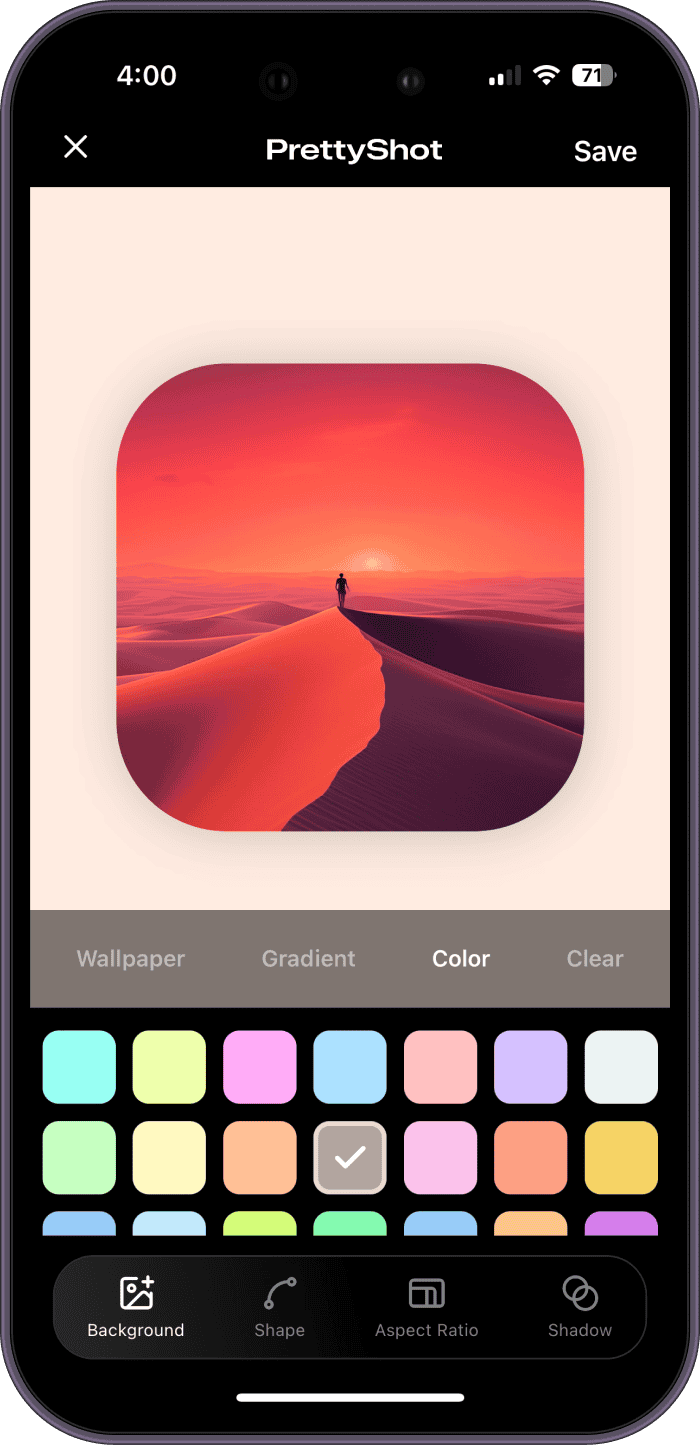
Changing the canvas can alter the apparent padding, wallpaper crop, and position of the screenshot. Review all four edges and make a small adjustment if the composition feels unbalanced. A wallpaper subject that worked in Square may sit behind the screenshot in Tall.
Export a separate version for each platform you care about. The extra minute protects text size and background placement. PrettyShot keeps the styling controls together, so adapting an existing design is quicker than rebuilding the post in a general-purpose editor.
Questions about this workflow
Is square or portrait better for a screenshot post?
Portrait usually gives a phone screenshot more screen space, while square is easier to reuse. Choose the format that keeps the important text largest.
Should I let social apps crop my screenshot automatically?
It is safer to export the intended ratio yourself. Automatic crops can remove context, clip shadows, or place platform controls over important content.